Notes On My Mother's Decline
Desiree Nasim is a New York-based designer and Graphic Design graduate from the Fashion Institute of Technology. Her work has been commissioned by actors, directors, and more in the industry.
Learn more about Desiree at desireenasim.com. Follow her on Instagram @desicreative or Twitter @desinasim.
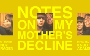
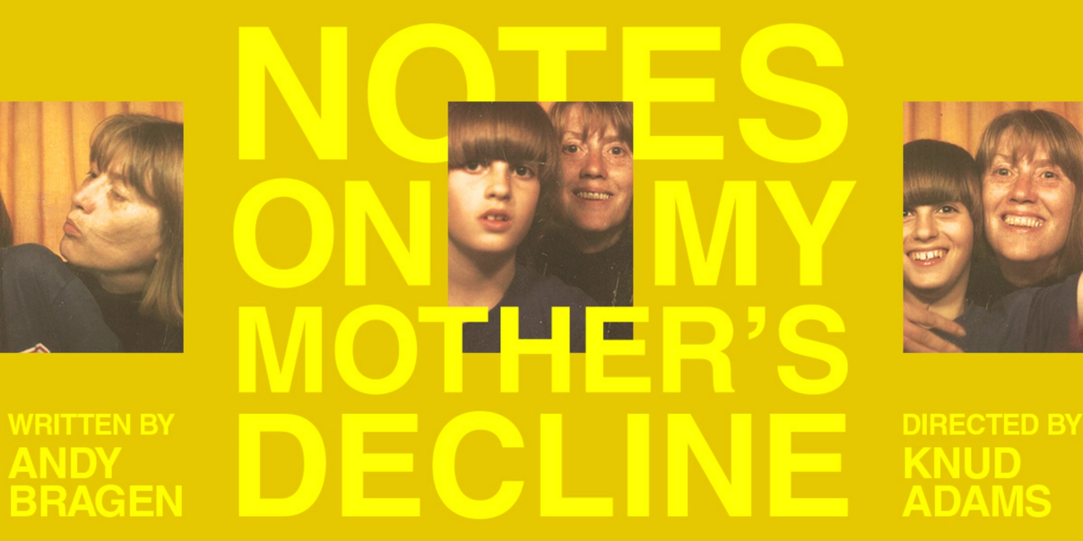
In the case of Notes on My Mother’s Decline, playwright Andy Bragen, director Knud Adams, and the company are telling a story about a Mother and Son’s relationship, and how the Son contends with their past and present. It’s a story that must also be reflected in the play’s key art, which we revealed late last month.
Graphic designer Desiree Nasim, through several brainstorms, drafts, and iterations, created the key art for Andy’s story. The playwright shared his personal photos for the production, a whole slew of Polaroids and film strips for Desiree to choose from. With the efforts of matching tone with text, text with color, color with story, Desiree has created a vibrant piece that joins memory with the present, capturing Notes in a single image. Her design will represent the play across postcards, Instagram posts, and in the theater when we begin performances next month.
Desiree had a chat with PlayCo’s Marketing Fellow Danielle Gutierrez to discuss her key art design for Notes on My Mother’s Decline.
What were some of your first impressions upon reading Notes? Of the characters, of Andy’s writing?
Notes is a true story, and when reading the script, there’s no doubt about it. I found Andy’s writing to be incredibly raw, honest, and powerful. While the play is about his life, his experiences and his relationship with his mother, the overall subject is universal. Whether you’re a parent or a child, there is something to connect with. The way the characters evolve over time, how they interact, and their memories transitioning from one to the next are all elements that especially stuck out to me.
As you’re entering a new project, what are you on the lookout for from the subject when designing key art?
I first read the material and dive into the world. I research the setting, the time period, and the overarching themes. I then pinpoint any intriguing elements, like words or objects, and collect visual references that may contribute to the key art. This can include color, typographic style, and imagery.
This play works a lot with memory, and reconciling the past with the present. What visual ideas were sparked for you based on those elements of the script?
The ideas of connections and compare/contrast immediately came to mind when trying to bring out those elements. Past and present, Mother & Son then and now, the evolving setting… these were all factors I explored. “What comes to mind when we think of memory? Nostalgia? Time?” “Maybe there’s a texture that connects the two, a graphic element to stylize the image, or typography set in a certain style.” These were some of the questions and thoughts I addressed when collecting visual references.
Why was it important to feature images of the Mother & Son in the key art rather than, say, purely graphic elements?
This is a very personal play that digs deep into the Mother & Son relationship, so it was an immediate choice that there should be a strong representation of those characters. Graphic elements can be useful, but in this case, powerful photography that the audience can personally connect with was the way to go.
Along those lines, what was it like to work with the playwright’s own personal photos?
It’s a rare and special experience when one has the chance to work with a playwright so closely. Working with Andy’s personal collection of photos was what ended up triggering the most inspiration and really bringing the key art to life. Not only was I more connected to the story by getting to work with them, but the key art benefited as well. A piece of stock photography or an art directed photoshoot can’t compare to the real thing.
Why did you gravitate toward these photo booth images specifically while compiling ideas?
While we explored a variety of photos, the photo booth images included multiple frames within a single moment that summed up the Mother-Son relationship in a powerful, yet simple manner. They’re intriguing, nostalgic, and give the viewer a quick snapshot of what the play involves.
The color screams ‘70s to me — very appropriate for this play. Could you talk a little about the color palette?
Notes explores the idea of time, and while a portion of it takes place in the 70s, it also takes place in the present. With the goal of combining the two, I referenced colors from that time period along with colors from Andy’s personal photo collection. For example, the color of the furniture and the stained walls. I then meshed those nostalgic colors with clean, modern typography.
What are you hoping theatregoers will take away from your design?
I hope it allows them to catch a glimpse of what the play is about, I hope they take a moment to look at the real-life characters depicted, and I hope it intrigues them enough to buy a ticket and learn more.
Danielle Gutierrez